When we thought of revamping 123Greetings, the first thought was of our users. It was the ultimate design challenge: how can we make 123Greetings to be user friendly and highlight our 20,000+ ecards at the same time? The old 123Greetings site had a lot of clutter, and too many things going on at the same time. Visitors were not able to find the right ecard because we just have, well, a lot of ecards!
That’s why we’ve cleared away the clutter and taken out background images and anything else that has nothing to do with ecards and the ecard-sending process. We’ve put the mantle in every category so you can find the sub-category that you want faster. We’ve reorganized our categories and put them on the top level navigation bar, which freed the space for the layout. We’ve added the user friendly ajax boxes to showcase the most viewed, highest rated, most popular, and the latest additions to our ecard collection.
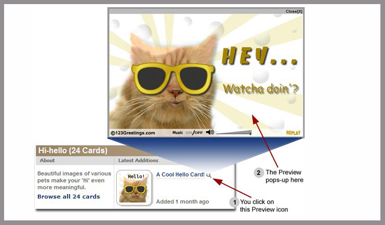
You can even see what’s most viewed and most popular in the category pages as well. You’re able to view the thumbs of ecards as well as the preview of the ecards. With the new design, you can send the message across to your loved ones faster instead of wading through ecards that might not be right for you or the occasion.


